Free Download. Swiss Quality Fonts. Made in Switzerland. Pixwar.
[X]
![]() Copy
Copy ![]() Short
texts
Short
texts ![]() Headline
Headline ![]() Experimental
Experimental
1 style 39 $
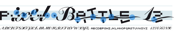
An epochal battle in form of font.
Calligraphic characters and pixel fight against each other in this experimental
font. Two historical epochs collude. You decide the destiny of the battle using
the shift button. The font is based on OpenType technology. Ligatures are required
for its correct functionality and must be switched on (both on professional
and office applications).
May the best win, with Pixwar.

Compatible with Mac and Windows.
![]()
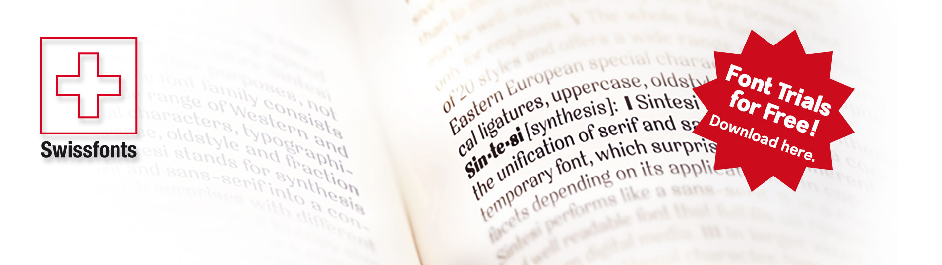
We offer a free package of our fonts for trial purposes. The package includes also a specimen (PDF) with further information on the font family. The license comprehends in addiction to trial purposes also the personal, non-commercial use of the fonts.
Free postcards set
You can download the trial package directly here:
Check the trial version of the font families Sintesi, Mimix, Stile, Geometrico and Segno for free.
For further information, you can find several online test tools and glyphs tables on myfonts.com
On this website you will probably find typefaces that you would not necessarily expect under the term “Swiss Design”. Nowadays, practically the same, more or less “accurate” variants of the Helvetica font are re-proposed again and again in the Swiss font design scene. Terms like “readability” or “functionning” are often misused to justify this form of conformism. We do not appreciate this development and see it as a form of flattening. Even Adrian Frutiger and Hans Eduard Meier, the intellectual fathers of the Swiss school, have shown more independence and courage with their projects “Avenir” and “Syntax”. With our work we want to prove that another way is possible. We even take pleasure in mocking, with our designs, the guardians of the Holy Grail of te so called “correct” typography.
Shape the personality of your product or communication material as it deserves with the help of our typefaces – accordingly to the corporate design idea. All the fonts on this website are Swiss Quality Fonts, made in Switzerland. FSdesign is a Swiss label with a neat and unique set of creative fonts and typefaces. All Swiss font families are technologically state-of-the-art developments, accurately drawn and proper in their technical realization. The well developed font families include a large number of font styles as well as special characters of both Eastern and Western European languages, typographical ligatures and figure sets. Their accurate metrics and kerning ensure a homogenous text color. The technically up-to-date OpenType format allows the support of several OpenType features.
![]() Copy
Copy ![]() Short
texts
Short
texts ![]() Headline
Headline ![]() Experimental
Experimental
1 style 39 $, font family (20 styles) 199 $
Sintesi Sans is the
font used for the copy of this website.
Sintesi Sans, a humanisctic sans serif, scores because of its readability,
robustness and contemporary style. It is a true Sans Serif and therefore
really flexible, universally applicable, especially as a body text font
and in a large number of applications. Thanks to its good readability
and wide set of styles and glyphs, Sintesi Sans suits perfectly to a
wide spectrum of applications.

OpenType for Mac and Windows. Avaliable as webfont.
![]() Copy
Copy ![]() Short
texts
Short
texts ![]() Headline
Headline ![]() Experimental
Experimental
1 style 39 $, font family (20 styles) 199 $
Are you looking for a robust, contemporary font with strong personality?
Sintesi Semi is a hybrid font which manages the “synthesis” between Sans and Serif in its own way. Due to its constant stroke the favorite font of the author is closer to a sans serif and scores with robustness and contemporary style. Its strong serifs though evoke rather a slab serif font. Prove character too, with Sintesi Semi.

OpenType for Mac and Windows. Avaliable as webfont.
![]() Copy
Copy ![]() Short
texts
Short
texts ![]() Headline
Headline ![]() Experimental
Experimental
1 style 39 $, font family (20 styles) 199 $
You would like to express tradition by using a contemporary font?
Sintesi might be exactly what you are looking for. Sintesi stands for synthesis – the unification of serif and sans-serif into a contemporary font, which surprises with different facets. Sintesi unfolds its traditional character. Its strong contrast and the feather-ductus stand out clearly. Combine antiquity with modernity!

OpenType for Mac and Windows. Avaliable as webfont.
![]() Copy
Copy ![]() Short
texts
Short
texts ![]() Headline
Headline ![]() Experimental
Experimental
1 style 39 $, font family (22 styles) 149 $
Looking for a geometric yet flexible character? Teorema is related to the popular Geometrico font family. According to a pragmatic approach that favors flexibility and ease of maintenance, a new geometric typeface was created. The font is distinguished by the contrast between perfectly circular shapes, and other, more angular ones in search of a formal balance aimed at optimizing the recognizability of the characters and finally the legibility of the text. Worthy of a geometric “theorem”? Try Teorema for free.

OpenType for Mac and Windows. Avaliable as webfont.
![]() Copy
Copy ![]() Short
texts
Short
texts ![]() Headline
Headline ![]() Experimental
Experimental
1 style 39 $, font family (24 styles) 149 $
Are
you looking for a modern typeface?
Even more futuristic than the classical Bauhaus typeface Futura, “Geometrico”
is a geometric typeface based on round shapes as suggested by its name. Designed
without compromises, neither in form nor in function: Geometrico is ideal for
logotypes, headlines and other modern typographic purposes. Would Paul Renner
be delighted? Or would he turn around in the grave? Make your own opinion.
Try Geometrico for free.

OpenType for Mac and Windows. Avaliable as webfont.
![]() Copy
Copy ![]() Short
texts
Short
texts ![]() Headline
Headline ![]() Experimental
Experimental
1 style 39 $, font family (22 styles) 149 $
Should it express power? Geometric and Slabserifs: a relatively rare combination. GeometricoSlab takes its cue from Herb Lubalin’s typeface family of the same name, and by using optical corrections with restraint, it looks a touch more uncompromising. The flexible, partly asymmetrical arrangement of the serifs avoids an overly heavy effect. The typeface family is suitable for both headlines and small point sizes. Curious? Try Geometrico Slab free of charge.

OpenType for Mac and Windows. Avaliable as webfont.
![]() Copy
Copy ![]() Short
texts
Short
texts ![]() Headline
Headline ![]() Experimental
Experimental
1 style 39 $, font family (10 styles) 149 $
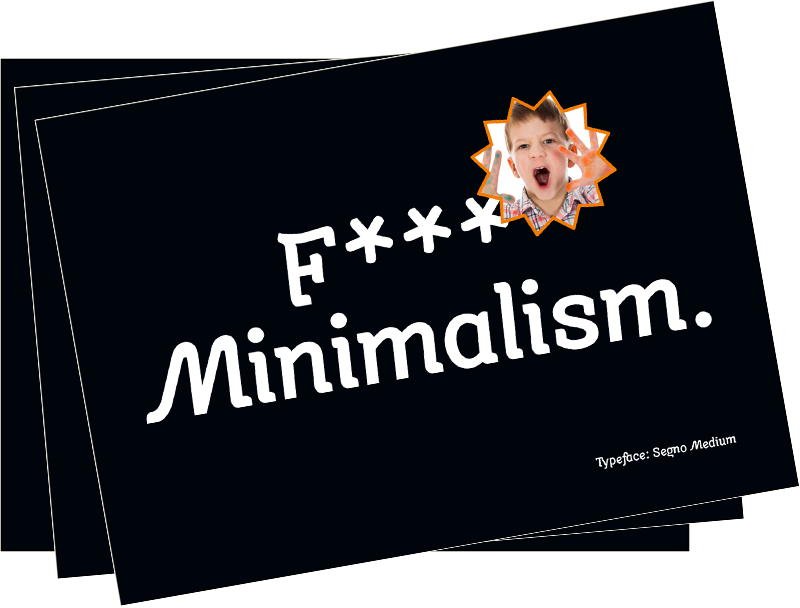
Cool, young and fresh, Segno surprises with his informal character and convinces for its careful execution. Its rounded forms and serifs evoke discretely the flow of a brush. Due to its moderate inclination Segno is easily readable and suits to more typographic purposes than you probably would expect from an informal typeface. Add a splash of freshness to your artwork, with Segno.

OpenType for Mac and Windows. Avaliable as webfont.
![]() Copy
Copy ![]() Short
texts
Short
texts ![]() Headline
Headline ![]() Experimental
Experimental
1 style 39 $, font family (8 styles) 149 $
Are you looking for a true cursive sans serif? “Stile” is a true cursive with moderate inclination, which has been developed particularly for the use as copy font. Stile has a good readability and is really flexible and universally applicable. While common italics with an angle of approx. 8 degrees while reading make your eyes quickly exhausted, “Stile” preserves them from fatigue. “Stile” is a sans serif with homogenous text color. Bring a personal style into your artwork. With Stile.

OpenType for Mac and Windows. Avaliable as webfont.
![]() Copy
Copy ![]() Short
texts
Short
texts ![]() Headline
Headline ![]() Experimental
Experimental
1 style 39 $, font family (10 styles) 149 $
Do you want to bring life into the page? Mimix is specially designed for typographers who like to play. This font is ideal to express spontaneity and joy of life. Where Mimix is used, there’s life. The characters are lined up in a row, a face is looking out of the page. Big ears surround an oval head. Mimix skillfully combines the elegance of a modern roman with the spontaneity of casual handwriting. Declare war on monotony – with Mimix, the one with charm.

OpenType for Mac and Windows. Avaliable as webfont.
On this website you will probably find typefaces that you would not necessarily expect under the term “Swiss Design”. Nowadays, practically the same, more or less “accurate” variants of the Helvetica font are re-proposed again and again in the Swiss font design scene. Terms like “readability” or “functionning” are often misused to justify this form of conformism. We do not appreciate this development and see it as a form of flattening. Even Adrian Frutiger and Hans Eduard Meier, the intellectual fathers of the Swiss school, have shown more independence and courage with their projects “Avenir” and “Syntax”. With our work we want to prove that another way is possible. We even take pleasure in mocking, with our designs, the guardians of the Holy Grail of te so called “correct” typography.
Shape the personality of your product or communication material as it deserves with the help of our typefaces – accordingly to the corporate design idea. All the fonts on this website are Swiss Quality Fonts, made in Switzerland. FSdesign is a Swiss label with a neat and unique set of creative fonts and typefaces. All Swiss font families are technologically state-of-the-art developments, accurately drawn and proper in their technical realization. The well developed font families include a large number of font styles as well as special characters of both Eastern and Western European languages, typographical ligatures and figure sets. Their accurate metrics and kerning ensure a homogenous text color. The technically up-to-date OpenType format allows the support of several OpenType features.
All the fonts © FSdesign,
Filippo Salmina
FSdesign, Im Wingert 6, 8049 Zurich, Switzerland, info@swissfonts.com